Client:
Tendonitis Reset
Date:
Type:
Website
Role:
UI/UX Designer
Tendonitis Reset is a digital product business I built entirely from the ground up, and one of the projects I'm most proud of in my portfolio.
Every piece of it was designed by me: the logo, branding, book cover, website, and the guide itself, all crafted in Figma and brought to life in Framer. What started as a deeply personal mission (having navigated wrist tendonitis myself through my early twenties) successfully became a product designed to help others on that same path.
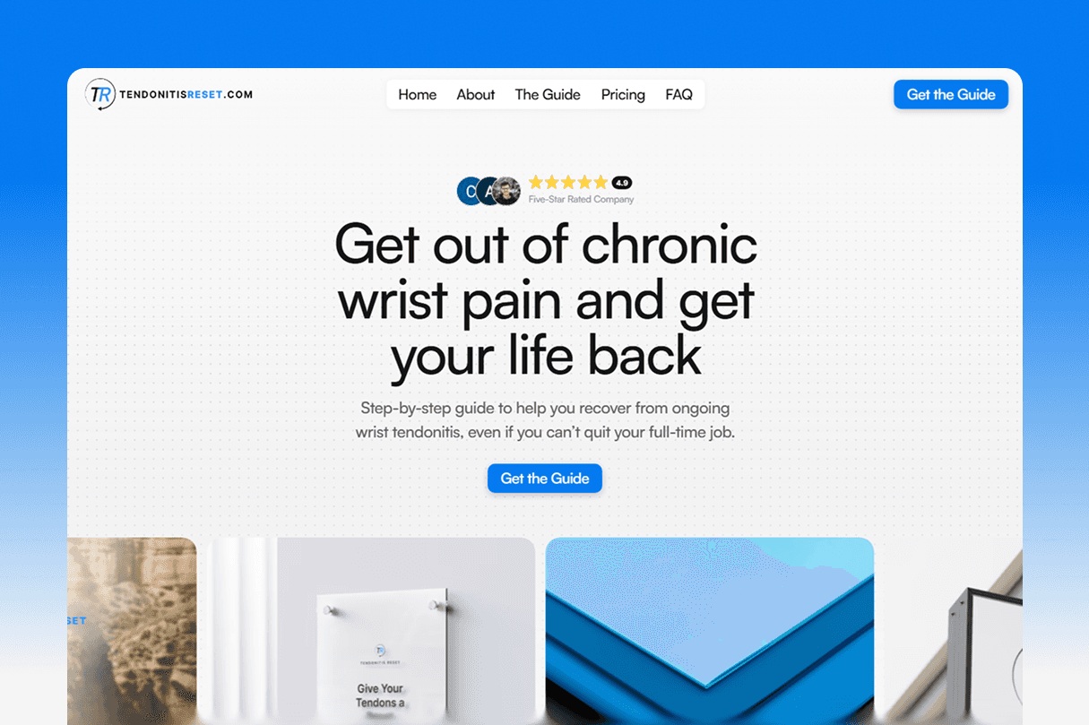
Brand & Logo Design
The logo was an opportunity to communicate the company’s core values visually. I wanted it to feel sporty and clinical, but more importantly professional and trustworthy to feel like a credible alternative to in-person physical therapy companies.
I chose a circular arrow around a TR to signify “resetting” your tendons. The “TR” itself is tilted forward slightly to suggest moving forward to recovery. The words “TENDONITIS RESET” are in all caps and bolded to feel strong and premium.

Website & UX
The website was built around four key brand adjectives: clean, bright, trustworthy, and hopeful. These are the main branding adjectives I wanted people to think and feel about Tendonitis Reset when visiting the site. Every design decision was made with these in mind. Generous whitespace across the site gives the eyes enough room to process the information. A clinical white background makes it feel clean, clear, and credible. Impressive yet simple animation adds professionality without distraction. And large, high-contrast CTAs guide the user to the one task I wanted them to take: getting the guide.
The result is a clean, bright, and focused user experience with a clear conversion path.
Checkout & Backend
The checkout is fully functional and handles everything automatically once a customer pays. It connects Stripe, Render, GitHub, Cloudflare R2, and Resend to make the delivery experience smooth and secure.
When someone completes a purchase through Stripe, the system kicks off a chain reaction. Render grabs the PDF guide from Cloudflare R2, generates a download link that expires in 48 hours, and Resend sends an email to the customer with that link attached. The link expires after a set window, which adds a simple but effective layer of protection against the guide being shared or resold.
Additionally, when a customer selects “Keep me updated with news and personalized offers” at checkout, they’re email is saved in my Resend account for future marketing emails.
Setting up the backend for this project opened my eyes to how complex some of the simplest customer journey steps can be. It baffled me that there was so much to set up just for an instant email with an expiring link to be sent after checkout! But definitely a fun experience to learn all the steps and piece them all together.
Overall
Overall, this was a fun and heartfelt project that I could not be more proud of.